Rebuilding a Community Radio Station's Online Identity
Role: Design Director & Developer
Context
Hollow Earth Radio launched in 2007 to provide audio not heard on the radio dial. Found sound, field recordings, local musicians, bedroom recordings, whatever worked -- eclectic, freeform, experimental, and community-driven. Founders Amber Kai Morgan and Garrett Kelly built it from their attic, ran it as an internet-only station for six years, earned an LPFM license in 2013, and by 2017 had KHUH 104.9 FM broadcasting across central Seattle.
When the founders moved on to other projects, the station absorbed the transition the way all-volunteer organizations do: the people who showed up became the institution. Momentum depends entirely on who steps up when. Since the pandemic, the website has lacked a steward. The 2010 codebase sat untouched while the station changed around it through the 2020s.
When I started volunteering for Hollow Earth, I said that we needed a new website. The problem with saying something this out loud in an all-volunteer organization is it automatically makes you the person responsible for making it happen. Rookie mistake. I did it anyway.
The Problem
The 2010-era codebase hadn't been meaningfully touched in over a decade:
- Nobody on the current volunteer team knew how to make changes to the code — and were afraid to try
- Editing the site came down to who could remember how to get in and edit it, as there was no documentation
- The 14-item top navigation represented initiatives and ideas that had come and gone over the years
- Strange quirks in the design, e.g. the events calendar listed the oldest events first
- And, of course, everything that came with a website built 15 years ago:Spacer GIFs, dated markup, unclear mobile support
The one early decision was to move off hollowearthradio.org to khuh.fm, the station's call letters. Partially it was about a new start for the station, but mostly it was we couldn't just redesign the old site, especially not while it was inflight.
Discovery
I talked to DJs and volunteers, some who arrived after Garrett and Amber left, some who actually broadcast from the attic. I centered my research conversations on identity: Who are we now? What does the station need to communicate right now? How do we honor the original DIY vision without being trapped by it?
The community had real affection for the old site's earthy browns and retro, countercultural weirdness. (Probably not a surprise when you're named for the Hollow Earth theory.) They wanted something that represented them where the station is now and could grow with them. And they didn't want a cookie cutter corporate radio website.
What the Field Looked Like
Before committing to any direction, I surveyed around 20 radio station websites, from local community stations to national and international examples. The range ran from Seattle neighbors (KEXP, Space 101.1, Rainy Dawg) to US non-commercial stations (WFMU, KBOO, WXPN). I also reviewed some notable Australian non-commercial stations (PBS FM Melbourne, Triple R, 3CR, fbi.radio). I was looking for how they handled the core problems: communicating identity, surfacing programming, and representing community.
The biggest single influence was the Australian community station PBS FM Melbourne. PBS had a lot of things I liked: A clean calendar format, show pages that compressed identity and schedule into one place, and a visual system built around solid color with a slight geometric askew to the layouts. Strong information architecture with a little quirkiness was exactly the register KHUH needed.
I also looked at stations already running Creek (XRAY.fm, KWMR) to understand integration patterns, and at similar low-power freeform stations to see how their communities represent themselves online.
My biggest takeaway was "Make a site, not an art piece." The old hollowearthradio.org was as much a visual statement as it was an information source. Sites like PBS Melbourne showed a middle ground: A well-structured design and information system that holds the station's full personality without becoming precious about it.
The tension in design was avoiding two failure modes: sterile, soul-less minimalism on one end, and nostalgic kitsch on the other. At the same time, I wanted something for the moment we're in with internet culture -- the so-called "Dark Forest vs Cozy Web" dilemma and the need to rebuild connection and community online post-pandemic. As Erin Kissane said in her 2024 XOXO talk, "fix the f**king networks."
Design: Going Underground
I ran a systematic color study covering more than ten named directions before committing: from alpenglow oranges & purples to tones of rose colored sandstone, green mosses, sandy beaches, subterranean blues, and magma. Each was applied to a header component — same layout, fifteen-plus labeled variants — to see how the station's identity held before any full-page decisions were made.
From these fifteen I built out six distinct homepage directions. Most explored warm earth tone territory. I did try one suggestion from the community for a near-black, high-contrast, harkening back to turn of the millenium hacker and Geocities design tropes. It looked amazing, but it wasn't Hollow Earth.
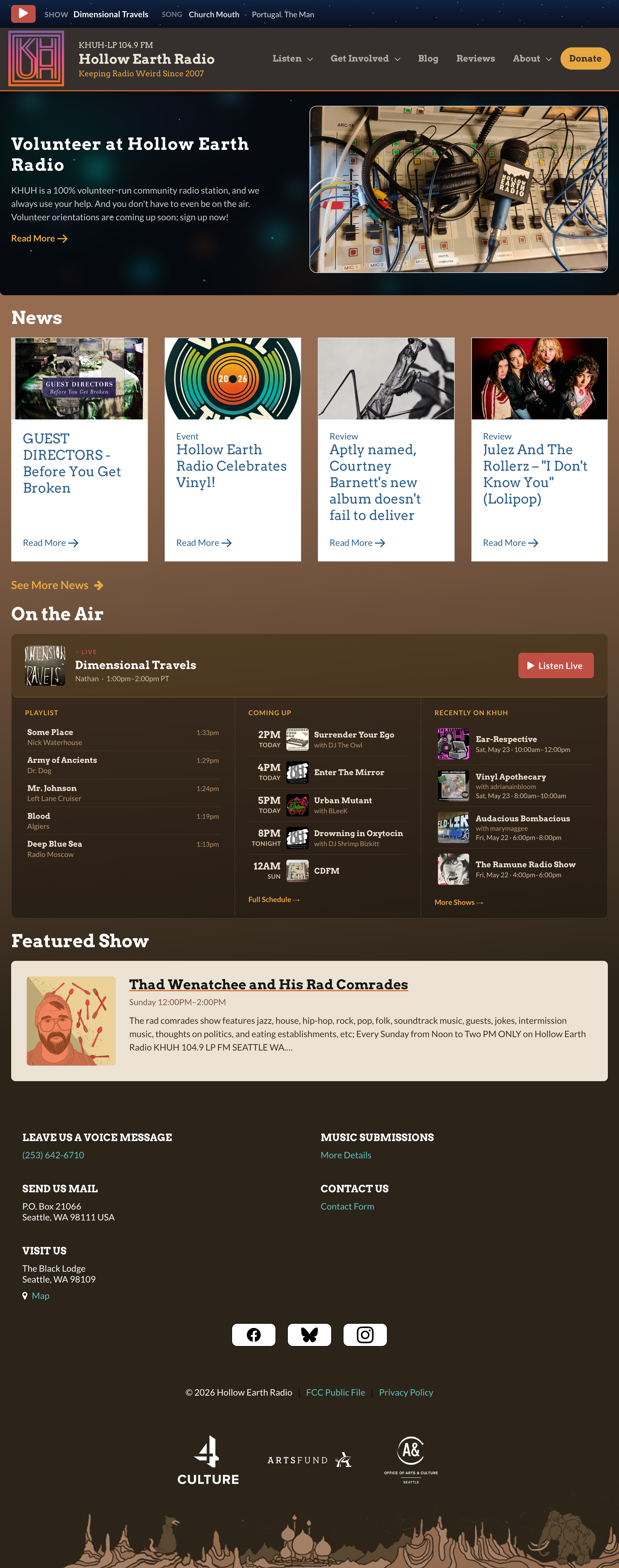
I eventually landed on a color set I dubbed "Cavern Glow / Brown Roots," containing ambers, warm neutrals, bone white, stone grey, cavern teal that echoed the previous site palette while departing from it. I wanted a look that brought the user underground: ember orange as the primary accent, bone (#EDE3D4) for surfaces, and a full neutral scale running from pale sand to near-black brown. A fixed-attachment gradient background that gets darker as you scroll adds a sense of depth.
Typography pairs Arvo (slab serif) for headings and navigation with Lato for body and UI. Arvo calls back to the previous site's handdrawn slab masthead, but as a actual font with weights and geometry. Lato is a clean, humanist sans-serif that balances Arvo's personality with readability and warmth, and it's one of my favorite typefaces. Both are widely available Google Fonts, so they're free and easy for future volunteers to work with.
I threw in some personal quirks and callbacks, of course. I drew specific earth tones from clays and loams of my own past, e.g. the red dirt and yellow clay of Oklahoma. I gave a little thank you to PBS Melbourne's influence on the site with a 175-degree gradient tilt in the gradient background, a nod to their slightly askew block layouts. And I was inspired by the carnivorous bioluminescent worms in New Zealand's Waitomo Caves to come up with a CSS-only "Bokeh Cave" effect for hero backgrounds — light-dot clusters blurred over a dark gradient, pure radial-gradient stacking with no images or JavaScript.
A weird station should have weird nods and winks in its website.
All of this was codified into a full brand and UI style guide, color tokens, typography specimens, component library, gradient and surface reference, so future contributors have a clear system to build within.
Look, Ma, I Used AI
For this project, I used Claude Code as a primary development partner, relying on generative AI for assistance.
In practice, I worked as the "design director in the loop," directing the aesthetic, making every significant design call, and hand-editing code when output needed refinement (or when Claude just wasn't getting the details right). The AI accelerated ideation, but it didn't replace design judgment. (And to be honest, it needed a lot of guidance on aesthetics.) The Bokeh Cave effect, the color token explorations, the type pairing, the gradient system: All of these were guided by my creative direction combined with Claude Code's grunt work.
Artificial intelligence works best as a tool for augmenting human creativity, not replacing it.
Technical Approach
The most paramount constraint of the project was that volunteers have to be able to maintain this. The old site was hard to maintain precisely because institutional knowledge to edit it had faded. We couldn't let that happen again.
The technical approach focused on maintainability and accessibility for volunteers:
- Nuxt/Vue (via Creek's toolkit): Modern frontend framework, structured and approachable for future contributors, and a proven, documented framework in general use
- Ghost CMS: Gives non-technical staff a real editorial interface for news and blog content, combined with a user-friendly interface
- Creek: Handles playlist data, show scheduling, and real-time music auto-recognition; the site reflects what's on air without anyone touching code
Outcomes
- Maintainable by volunteers. Any station member with Ghost access can publish, update, and manage content to the site without a developer.
- Identity clarified. KHUH presents as a modern, volunteer-driven, community-focused institution of Seattle music and culture
- Live programming better surfaced. Creek integration means the site always reflects what's on air, in real time, along with playlists and show archives.
- Navigation rationalized. Cleared the old cruft and cut top-level navigation options to six: Listen, Get Involved, Blog, Reviews, About, Donate.
- Design system established. A full brand and UI style guide means future contributors can build without reverse-engineering decisions.